
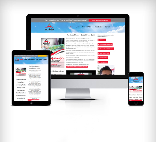
Responsive Website Design
A responsive website is single website that adjusts to any screen size.Based-on it’s as easy to use any type of computing device like mobile, tablet and desktop – no tweak or horizontal scrolling required.
We are specialising in responsive web design and development and we have excellent practice in SEO development, we provide a unique base to support your brand’s growth and presence in the online community.
Responsive website design ensures that your website will adapt to each and unique device used to access your site. The best responsive website automatically re-sizes website content, images and there functionalities on Mobile Phone, Tablet, Desktop. By adapting this look and feel, Responsive development ensures flexibility of brand and an improved user experience basically leading to increased sales enquiry and conversion.
Responsive Design -Rapidly Growing Mobile Usage
When it comes to making your website both mobile friendly and search engine friendly. Mobile web use is developing at a great & rapid rate that presents immense opportunity. A Website that isn’t responsive for mobile phones/devices could possibly miss out on a lot of business opportunities. Our expert responsive designs deliver extraordinary results for desktop, tablet, and mobile users. Responsive website design ensures that every user experience is an excellent one.
Many benefits in designing new responsive website
- Google suggests it
- Management of website content is reduced
- Minimizes possible SEO problems like duplicate content
- It’s profitable
- It’s what your possible customers expect.


Lets Get Started your project
We will help you to achieve your goals and to grow your business.
REQUEST A QUOTE
Things we have done
We are building bridges in web technology in order to connect the client’s goal to reality
VIEW FULL PORTFOLIO